ADVANCED TYPOGRAPHY PROJECT 2

Ating Otobong Melvin Abang
Advanced Typography
Project 1 - The Trouble Makers Manifesto.
LECTURES
Week 8:
14|10|19
Week 9:
21|10|18
INSTRUCTIONS
PROJECT 2
Week 8
14|10|2019
This is the continuation of The trouble makers manifesto from the first project, we're instructed to make a poster, 3 collateral and a micro-site from our final key artwork (The Troublemakers Manifesto). and this collateral is based on Project 1
The Design School,
Taylor’s University
The Troublemakers Manifesto: A Design Colloquium
Open Public Lectures:
November 8, 2019
Lew Pik Svonn, 9AM-10AM
Ezrena Mohd., 10AM-11AM
Suzy Sulaiman, 11AM-12PM
Muthu Neduraman, 1PM–2PM
Fahmi Reza, 2PM-3PM
Fahmi Fadzil, 3PM-4PM
Lecture Theatre 12
Collateral 1: Poster
 |
| Fig 1.1 first poster idea |
| I decided to just use the fonts from my key artwork for the poster but it doesn't seem to be working out. |
 |
| Fig 1.2 Second poster idea |
 |
| Fig 1.3 Third Poster idea |
and I made a few of the font color yellow to match the Key artwork.
I noticed that the type for the word MAKERS was in white and the paper was gonna be white so it wouldn't be seen so I changed it to black.
I noticed that the type for the word MAKERS was in white and the paper was gonna be white so it wouldn't be seen so I changed it to black.
 |
| Fig 1.4 Fourth Poster Idea |
 |
| Fig 1.5 Fifth and Final Poster Idea |
I didn't like the previous Arrangement of the Text it seemed to clustered and lack of utilized space.
So I moved the Lecture 12 to the top Left and Moved the Design Colloquium to the top right
and I moved the speakers one to the left and one to the right so spacing can be utilized.
Here Is The Final PDF
Collateral 2:T-Shirt
This was the first time I've ever designed any shirt so I slowly broke down pieces of my key artwork and played with different arrangements and text. So I focused on the front of the shirt first
FRONT DESIGN OF THE SHIRT
I noticed that the shirt is the same whether front or back it's interchangeable. I used the word TROUBLE first then anded the outline to see how it would look like it wasn't working out I didn't like it.
I then thought about removing the outline and the word trouble switching that out for the design Colloquium because I remember Mr. Vinod stating that the Collateral, of course, should have a clear statement and should be easy to tell. However, I liked the X at the side from earlier so I kept it and continued playing around with different arrangements.
further thinking I duplicated the X icon that was by the side and put it above the text then I added a non-objective element which was the rectangle to encompass the text so it looked balanced. the more I looked at it the more it looked like a pair of eyes and a mouth.
BACK DESIGN OF THE SHIRT
I then added the image and the outline at the back and rearranged the Text leaving one in white and one in blue.
i decided to separate the text from the drawn outline and further add the X in the middle I always keep the first idea to compare as I make progress.
after making the 3rd concept, I looked through all and decided to choose my final front and back design.
Front and Back Design after feedback in week 11
the front design was ok but I had to work on the back of the shirt
I would love to redo the key artwork but there's no time so I worked on the choice of typeface and the overall arrangement.
for this second idea, I changed the typeface and included wings to signify the freedom designers have.
I spread the makers around the artwork and resized the x and put it back over the mouth.
I kept the X as the central element and introduced the text trouble on one side and the text Makers on the other side the back.
I then added two X's in the front and included my yellow outline at the back so it has identifiable features with my shirt design. so I went further to try out different color variations.

i decided to print only the front design only reason funding and time.
Final Versions of collaterals(1-3)
this is the flat lay of all my collateral's.
my design/key artwork is compromises of different aspects of a troublemaker.
Micro-Site
Link:
week 8
14|10|19
i was working under a bit of pressure because i had to allocate time to complete and refine my project 1 and complete my project 2.
Week 9
21|10|2019
The final project was around the corner, and everyone seemed tensed assuming we all had a lot on our minds besides Advanced typography
but Mr. Vinod spoke to us and he helped elevate our mood.
FURTHER READING
In this article the author shares' perspective as a
the habit of drawing often should be developed upon, ideally, twice a day, is essential. These do not have to be long sessions, but the idea is to do it often and with a fresh mind that is open to new approaches. It is through these sessions that recurring patterns of interest form.
From one day to the next a similar visual idea can be approached anew when it offers something of interest to explore.
When a fair amount of letters have been shaped in their essential forms, fitting them together to words is where the actual work of designing a typeface takes place.
How the various shapes of different glyphs affect each other and space around and in-between them is where a well-designed font is more than simply the sum of its letters. Often what looked good by itself does not work well when used in the context of other words.
This was the first time I've ever designed any shirt so I slowly broke down pieces of my key artwork and played with different arrangements and text. So I focused on the front of the shirt first
FRONT DESIGN OF THE SHIRT
 Fig 2.1 The First Idea-Concept 1: Front of Shirt |
 |
| Fig 2.2 The Second idea Concept 1: Front of Shirt |
 |
| Fig 2.3 The Second idea -Concept 2 and 3: Front of The Shirt |
it started looking a bit like KAWS, KAWS is an American artist and designer. and is known for having characters and art with 2 X markings.
Here are a few of his label's shirt design and NOTE: I didn't reference this or any of his art, the idea came from my head and from that I realized a similarity.
I made mine different from his work by separating the X, spacing it apart.
 |
| Fig 2.4 Kaws Clothing Line and his iconic use of the 2 X's |
BACK DESIGN OF THE SHIRT
After doing a few concepts of the front I then moved on to how the back of the shirt would look like. I did the same thing slowly breaking down pieces of my key artwork playing and rearranging here and there with different arrangements of both text and outline.
 |
| Fig 2.5 The First Idea-Concept 1 Back of the Shirt |
 |
| Fig 2.6 The First Idea -Concept 2 Back of the Shirt |
 |
| Fig 2.7 The First idea concept 3 Back of the Shirt |
Front and Back Design after feedback in week 11
 |
| Fig 2.8 The first design for front and back. |
I would love to redo the key artwork but there's no time so I worked on the choice of typeface and the overall arrangement.
 |
| Fig 2.8The second design for front and back. |
 |
| Fig 2.9 The Third design for the front and back |
 |
| Fig 2. 10 Fourth and Final T-shirt design Front and Back |
Collateral 3: Tote Bag
I began the tote bag design.
For my first trial, I added the x and the hands.
i then made the back and put it side by side with the front but i felt i needed to experiment more add something more.
I began the tote bag design.
 |
| Fig 3.1 First idea trial 1 front |
 |
| Fig 3.2 Second idea front and back |
 |
| Fig 3.3 Third idea front and back |
 |
| Fig 3.4 Fourth idea front and back |

Fig 3.5 Different Colour Variations front and back
I tried different color variations and then I decided I liked the white and yellow best.
 |
| Fig 3.6 Final Tote Bag Design. |
Final Versions of collaterals(1-3)
my design/key artwork is compromises of different aspects of a troublemaker.
the X being the opposition that prevents us as designers from speaking up and expressing creativity.
the wings representing the freedom designers have.
 |
| Fig 4.1 Flat Lay of all collaterals. |
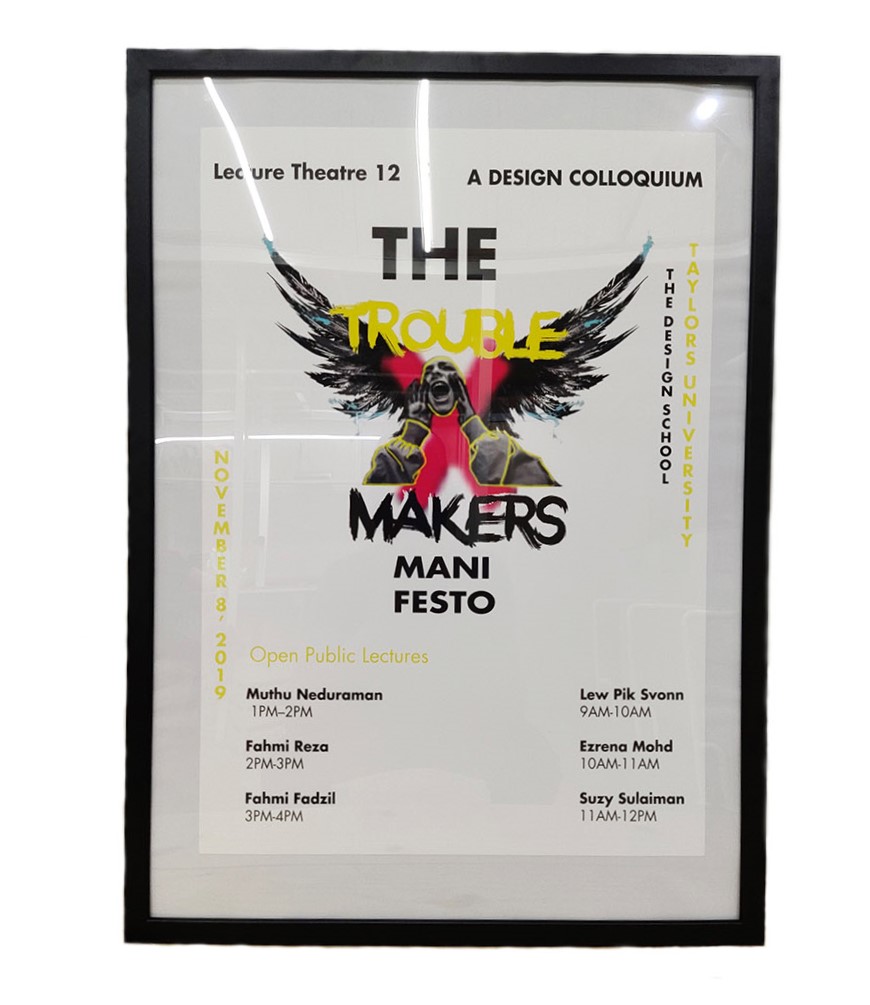 |
| Fig 4.2 Printed and Framed Poster. |
 |
| Fig 4.3 The Font and The back of the Shirt Worn by the User |
Micro-Site
 |
| Fig 4.4 ScreenShot of Microsite |
 |
| Fig 4.5 Screen Shot of Micro Site |
FEEDBACK
Week 8
14|10|2019
No feedback
Week 8
14|10|2019
No feedback
Week 9
21/10/2019
General feedback: Keep in mind that when designing the collateral it has to be understandable and must convey the design colloquium as you might be confronted about your collateral
Specific Feedback: Move the word Trouble so it doesn't clash with the face and make it the same typeface as the Makers and the tape.
Further feedback: the key artwork is coming together, remove the wordings, for now, make the tape red in color and the play around with the wordings. Your Choice of typeface isn't working with the key artwork change it.
REFLECTION
EXPERIENCES
week 8
14|10|19
at this point, my ability to rethink and come up with good concepts were quite challenging.
Week 9
21|10|2019
I finally had some concepts down and got approval and working based on the received feedback and not ditching the whole idea really proved very helpful because I tend to ditch ideas.
OBSERVATIONS
week 8
14|10|19
I was too comfortable with my artworks and it was hard for me to accept the feedbacks given and build on that but I had to do so.
Week 9
21|10|2019
The final project was around the corner, and everyone seemed tensed assuming we all had a lot on our minds besides Advanced typography
but Mr. Vinod spoke to us and he helped elevate our mood.
FINDINGS
week 8
14|10|19
i was working under a bit of pressure because i had to allocate time to complete and refine my project 1 and complete my project 2.
Week 9
21|10|2019
The final project was around the corner, and everyone seemed tensed assuming we all had a lot on our minds besides Advanced typography
but Mr. Vinod spoke to us and he helped elevate our mood.
FURTHER READING
 |
Fig 5.1 From idea to typeface: How are fonts designed? by Johannes Neumeier |
type designer and describe some general as well as some idiosyncratic approaches to designing fonts.
 |
| Fig 5.2 Sketches |
the habit of drawing often should be developed upon, ideally, twice a day, is essential. These do not have to be long sessions, but the idea is to do it often and with a fresh mind that is open to new approaches. It is through these sessions that recurring patterns of interest form.
From one day to the next a similar visual idea can be approached anew when it offers something of interest to explore.
 |
| Fig 5.3 Fonts |
How the various shapes of different glyphs affect each other and space around and in-between them is where a well-designed font is more than simply the sum of its letters. Often what looked good by itself does not work well when used in the context of other words.


Comments
Post a Comment