ADVANCED TYPOGRAPHY PROJECT 1
Ating Otobong Melvin Abang(0333700)
Advanced Typography
Project 1 - The Trouble Makers Manifesto.
LECTURES
Week 6:
23|9|19
This week there was a group presentation presenting the topic "Typographic composition" for this week Lecture Here is the PDF file below.
Environmental grids
Abstracting a series of lines and shapes from a physical site (location, scenery, buildings…) as a guideline for the placement of typography.
Alternative methods
Offer compositional options beyond traditional grids. The unequal divisions allow intuition and experimentation. Improvised methods use type alignment edges, points and elements as an alignment to form grids. They rely on their structure to achieve balance.
Manifesto
Beliefs that influence decisions in life, society, and communication. The people reveal and explain what they have done, their guiding points of view in their actions.
Ways to come up with ideas
Mind Maps
Have conversations (partner needs to have chemistry, unselfish; People who trigger ideas)
Breaking down the words using synonyms
Looking for Ideas
Make new input to take different roads. Go through many ideas because even if you have landed on the perfect one, in the beginning, you will never know until you tire yourself out with several ideas.
Mind map techniques
1. Breakdown the keywords
2. Come up with many visual ideas (draw the ideas quickly, don’t just write)
3. Merge the two ideas, draw sketches
Week 7:
7|10|19
This week there was a presentation by presenting "Typographic in different mediums" for this week Lecture Here is the PDF file below.
Static typography is used primarily in printing while kinetic typography moves typeface.
Environmental typography uses trees, balls, and other architectural elements. 3D typography adds the display option's extra depth.
The distinctions between virtual reality and augmented reality are that virtual reality is the platform of communicating with a headset.
INSTRUCTIONS
PROJECT 1
23|09|19 (Week 6)
In this project, we are supposed to create a key artwork for an upcoming event named 'The Troublemakers Manifesto - A Design Colloquium. In which the design created for the key artwork will be used for different collaterals of our choice.
 |
| Fig 1.1 reference images |
OR
PROCESS
Digitization of the Key art work
 |
| Fig 1.2 Demon Samurai Mask. |
 |
| Fig 1.4 2nd Digitization |
 |
| Fig 1.5 3rd Digitization |
 |
| Fig 1.6 4th Digitization. |
 |
| Fig 1.7 Outline |
Building Upon the Idea of the Outline created
 |
| Fig 2.1 Adding the Wordings |
 |
| Fig 2.1 Rearranging the Wordings |
 |
| Fig 2.2 Wings |
 |
| Fig 2.3 Key Artwork |
I sent the wings to the back, changed the typeface to one I downloaded called Overdose Sunrise. Then I sent the X tape to the back of the outline but the front oft he wings.
 |
| Fig 2.4 Colour Change. |
Here is the PDF
FEEDBACK
Week 6
9|30|2019
General Feedback: We were told not to use the Cliche Light bulb in our design and that we should abstain from using a black background. And Mr. Vinod Took us through the Process Of getting an idea which could be either Mind mapping or Interacting with different people on the subject matter.
Specific feedback: Mr. Vinod and Mr. Samshul commented on my work saying that My work can be open to 2 interpretations as in the samurai demon mask can either be seen as cultural or evil. And that I should make or find a symbol that communicates trouble effectively.
Week 7
7|10|2019
Please make your files visible (public) for your exercise portfolio. Your Typo Sys exercise is not complete! Your finding type exercise shows a severe lack of progression. The final result is reflective of the lack of work done on the type! There is no reflection, no feedback visible and no further reading. You are endangering your semester.
General Feedback: We were told to look at the facebook page so we can better understand how our key artwork is meant to be, and also have an idea of what the event is meant to be about. Concerning Our Blogs, our final PDF file must be in Spreads and also when doing
REFLECTION
EXPERIENCES
Week 6
9|30|2019
Coming up with a good and realistic idea was or is quite hard to do given that I have to rethink the reason behind everything and required a bit of research.
Week 7
7|10|2019
Representing something that has to do with trouble is quite tricky in the sense where it can be misread so one has to be careful that after the feedback I received.
OBSERVATIONS
Week 6
9|30|2019
Most of the class hadn't yet completed our exercises including myself. We had to move fast in order to progress through Project 1.
Week 7
7|10|2019
Discussing with other classmates can hider your thought process and limits you withing a particular box, engaging with other's who might not be in your course helps broaden ideas and view of things.
FINDINGS
Week 6
9|30|2019
When coming up with ideas for certain things I sometimes require you to put something down a sketch or anything on paper before digitization.
Week 7
7|10|2019
Based on the feedback received, i reworked at my artwork which leads me to think again but taught me that this process could have been avoided through the detailed layout of plans and thought but after that i was quite satisfied with the work.
FURTHER READING
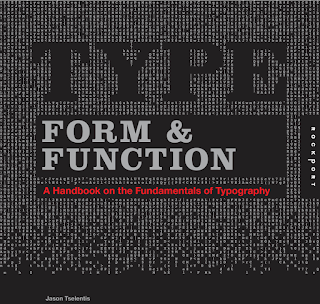
TYPE FORM AND FUNCTION
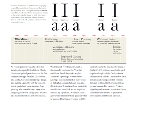
Claude Garamond achieved prominence as the first autonomous type founder as French printers started to embrace the typographic traditions of Veneto.
TYPE FORM AND FUNCTION
 |
| Fig 3.2 Printing |
Whereas French-type foundries like Garamond's maintained the Venetian traditions, Dutch foundries introduced letterforms with an almost rigid form.
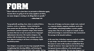
In order to help them develop an extremely functional product, typeface designers who create fully developed fonts must undergo some of the most strict training.
Developers can spend decades studying the history of typography, enhancing their drawing skills and fostering the motivation needed to make letters after letters. It is equally essential to have a keen visual literacy as it helps one create decisions objectively.
 |
| Fig 3.3 Form |
 |
| Fig 3.4 Experimentation |
Principles of Typography.
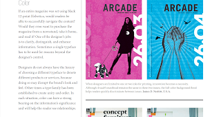
Note-When choosing color Would readers be able to navigate the content effectively if a whole magazine was set using black 12-point Helvetica? Would they even like a newsstand to buy the magazine, bring it home and read it? One of the tasks of the designer is to explain, differentiate and improve data. Sometimes it is necessary to use a single typeface for reasons beyond the control of the designer.
If each letter is recognizable without too much guesswork, a typeface is easy to read.
 |
| Fig 3.5 Color |
Note-When choosing color Would readers be able to navigate the content effectively if a whole magazine was set using black 12-point Helvetica? Would they even like a newsstand to buy the magazine, bring it home and read it? One of the tasks of the designer is to explain, differentiate and improve data. Sometimes it is necessary to use a single typeface for reasons beyond the control of the designer.
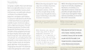 |
| Fig 3.6 Readability |




Comments
Post a Comment