FINAL PROJECT- EXPRESSION HIERARCHY/COMPOSITION
14/06/19 – 28/07/19 (Week 11 – Week 13)
Ating Otobong Melvin Abang
0333700
LECTURE 10
(WEEK 11)-14/6/19
In the past, typography was viewed as living only when it reached paper. Once a publication was edited, typeset and printed, it was done. Nothing changed after that. Good typography and readability were the results of skilled typesetters and designers. Typesetters are people who make typography before the digitized era and before the designers exist. Today, typography exists not only on paper but on a multitude of screens. It is subject to many unknown and fluctuating parameters, such as operating system, system fonts, the device and screen itself, the viewport and more.
Type for Print
Primarily, type was designed intended for reading from print long before we read from the screen. It’s the designer’s job to ensure that the text is smooth, flowing, and pleasant to read. To do this, they adjusted the kerning to make the reading experience better.
A good typeface for print-Caslon, Garamond, Baskerville are the most common typefaces that is used for print. Because of their characters which are elegant and intellectual but also highly readable when set at small font size. They are versatile, easy-to-digest classic typeface, which has neutrality and versatility that makes typesetting with it a breeze.
Type for Screen
Typefaces intended for use on the web are optimized and often modified to enhance readability and performance onscreen in a variety of digital environments. This can include a taller x-height (or reduced ascenders and descenders), wider letterforms, more open counters, heavier thin strokes and serifs, reduced stroke contrast, as well as modified curves and angles for some designs.
Another important adjustment – especially for typefaces intended for smaller sizes – is more open spacing. All of these factors serve to improve character recognition.
Hyperactive Link/ hyperlink
A hyperlink is a word, phrase, or image that you can click on to jump to a new document or a new section within the current document. Hyperlinks are found in nearly all Web pages, allowing users to click their way from page to another. Text hyperlinks are normally blue and underlined by default.
Font Size for screen
16-pixel text on a screen is about the same size as text printed in a book or magazine; this is accounting for reading distance. Because we read books pretty close — often only a few inches away — they are typically set at about 10 points. If you were to read them at arm’s length, you’d want at least 12 points, which is about the same size as 16 pixels on most screens.
Pixel Differential Between Devices
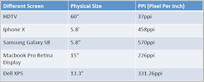 |
| Fig 1.1 Pixel differences |
Static typography has a minimal characteristic in expressing words. Traditional characteristics such as bold and italic offer only a fraction of the expressive potential of dynamic properties.
Motion Typography is a temporal media offer typographers opportunities to “dramatize” type, for letterforms to become “fluid” and “kinetic” (Woolman and Bellantoni, 1999). Film title credits present typographic information over time, often bringing it to life through animation. Type is often overlaid onto music videos and advertisements, often set in motion following the rhythm of a soundtrack. On-screen typography has developed to become expressive, helping to establish the tone of associated content or express a set of brand values. In title sequences, typography must prepare the audience for the film by evoking a certain mood.
- Saul Bass-Mr Samshul Adviced or rather Instructed Us to look up who this guy is.
He was an American graphic designer and Academy Award-winning filmmaker, renowned for designing movie title sequences, movie posters, and corporate logos.
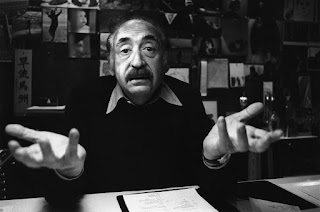 |
| Fig1.2 Mr.Saul Bass. |
Some Of his Works include......
The most popular title sequences are the animated paper cut-out of a heroin addict's arm for Preminger's The Man with the Golden Arm, the credits racing up and down what ultimately becomes a high angle shot of a skyscraper in Hitchcock's North by Northwest, and the disjointed text that races together and apart in Psycho.
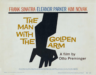 |
Fig 1.2 Poster of ''the man with the Golden Arm" A film by Otto Preminger.
|
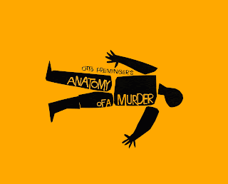 |
| Fig 1.3 Poster of "Anatomy of a Murder" a film by Otto Preminger |
INSTRUCTIONS
Final Project-Criteria: With the knowledge and experience gained in previous exercises and projects;
a) Express typographically a social message relevant to the campus community at Taylor’sUniversity (E.G: Smoking- Choose Life Not Tobacco)
b) Animate the message (72 dpi), it will be used on social platforms like Twitter, or Instagram or Facebook. You may use Photoshop Timeline or frame by frame, Adobe After Effects, Adobe Animate, In Design or Illustrator.
 |
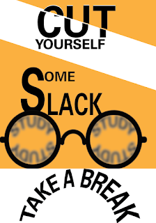
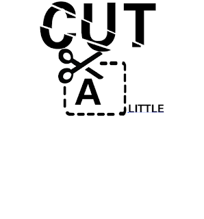
| Fig 1.4 1st Initial Chosen text to express. |
 |
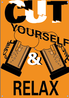
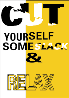
| Fig 1.5 2nd Text. |
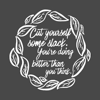
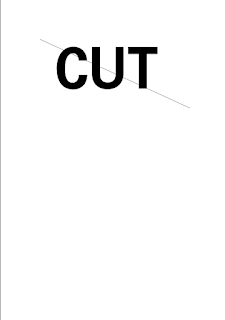
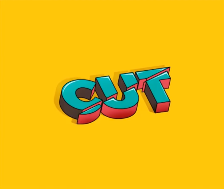
The Main reason for choosing this was I wanted to express cut and the other words have to contribute to the main word which was CUT and Relax or Take a break.
INITIAL CHOSEN TEXT PROCESS
Digitization.
 |
| Fig 1.9 Draft 1. |
 |
| Fig 1.10 Draft 2 |
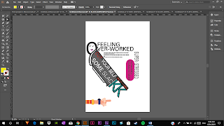
For the first draft, the issue with it was that it looked violent and could be easily misunderstood especially with the knife and for the second one the wordings were not expressed well and the concentration should be on a particular word and not the image.
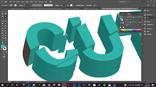 |
| Fig 2.1 I tried out expressing the text in 3D |
This time around i had the idea of actually cutting the word "CUT" and the font being Universe Bold but trying to see how it would look if it were in 3D.
 |
| Fig 2. 2 Continuation. |
 |
| Fig 2.3 Final 3D draft for 1st trial. |
I felt i needed to try out other methods so i continued drafting and trying.
 |
| Fig 3.1 Flat version. |
It tried again seeing how it would look flat so I made a basic layout but again cut yourself from what? I had to add something.
 |
| Fig 3.2 3rd Draft |
The feedback i got from this was that the messaged was everywhere and i should make use of only one color scheme. I should focus on the MESSAGE and the KEY words.
 |
| Fig 4.1 4th Draft. |
 |
| Fig 4.2 5th Draft. |
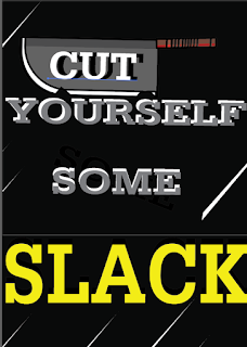
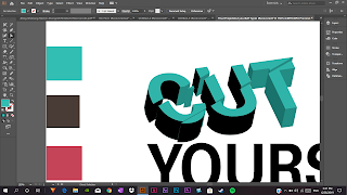
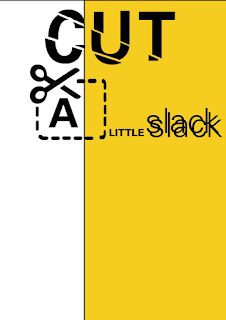
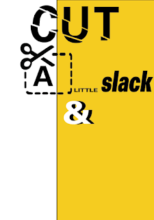
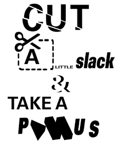
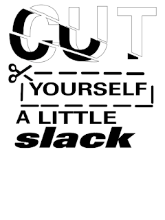
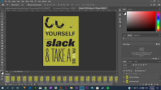
For the 6th trial, I looked up other ways i could respell or paraphrase the "CUT YOURSELF SOME SLACK" "TAKE A BREAK" and i found rephrased it as "CUT A LITTLE SLACK" AND(&) "TAKE A PAUSE".
6th Trial PROCESS
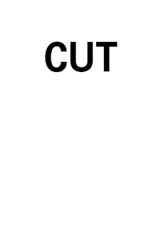 |
| Fig 5.1 Starting out with the Text "CUT" (Universe 65 Bold Type family) |
 |
| Fig 5.2 Putting a line over the wordings Cut. |
I wanted to show the cut in the text so in order to do that, i grouped it and then highlighted both then divided it so that i can get that effect.
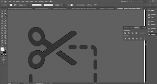 |
| Fig 5.3 Making the scissors cut over a vector. |
I made the Scissors cut by using the pen tool and the shape tool to get the exact look of the Scissors cut from the vector image.
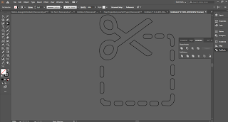 |
| Fig 5.4 Finished outline no fill. |
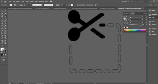 |
| Fig 5.5 Filling in the Scissors and the Cut Dots. |
 |
| Fig 5.6 Incorporating the Scissors Cut into the Earlier Composition. |
I added the Scissors cut into the composition and put the letter "A" into the scissors cut so it's Cut A little it's like a pun.
 |
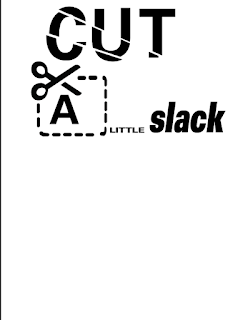
| Fig 5.7 Testing to see how it would look with color. |
 |
| Fig 5.8 Changing the font for slack". |
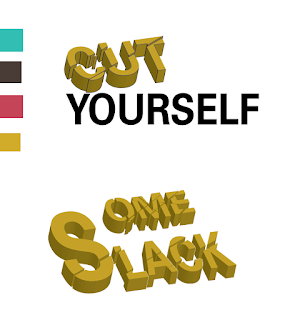
i changed the font Universe light to 85 Extra Black Oblique because i wanted to make it look more thinker and not thin.
 |
| Fig 6.1 Adding color to the composition |
I then added color to the composition to see how it would look when color is introduced.
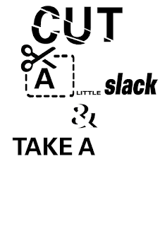 |
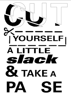
Fig 6.2 Adding "TAKE A" into the composition.
|
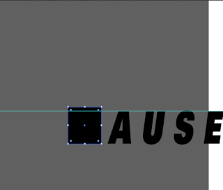 |
| Fig 6. 3 Making the Pause (play icon) Using a Square. |
I used the shape tool to make a square and further put a ruler to measure and make sure that the square is the same hight with the rest of the letters.
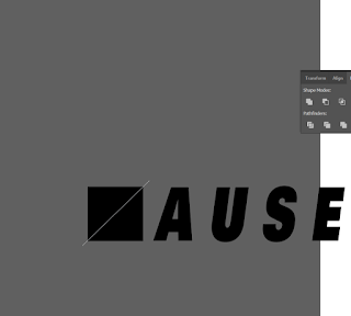 |
| Fig 6.4 Adding a line over the square. |
I added a line then made it white so it's visible then further sending it to the front of the square so that i can group then use the pathfinder tool to Divide it.
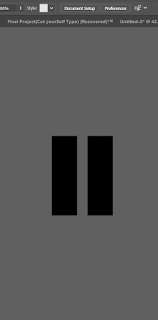 |
| Fig 6.5 The Pause Button |
I made the Pause button using the shape tool the rectangle tool.
I further planed to Make the Pause and the play button 3D in order to make it stand out and not seem flat.
Inspiration for 3D Pause and Play...
 |
| Fig 7.1 This is from an Illustrator Tutorial on Youtube. |
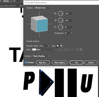 |
Fig 7.2 Making the Pause and the Play Button 3D Using the Extrude
and Bevel Options Under the 3D section. |
 |
| Fig 7.3 "play" and "Pause" Icon in 3D |
The icons were ready and i went forward to adding color.
 |
| Fig 7.4 Pause and play icon in color. |
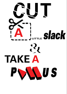
Color Scheme Testing
 |
| Fig 8.1 First Color scheme(Red). |
 |
| Fig 8.2 Second color scheme(Red) |
I changed the pause icon color to white because in the earlier color scheme, the first one the back ground's red seems to be overpowering the Buttons which were also red. So the white makes it stand out from the background.
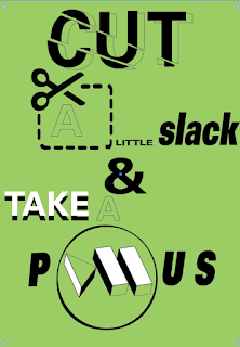 |
| Fig 8.3 Third color Scheme(Mint Green) |
I figured that I need to be a lighter color and also for this one, in particular, the other text beside the ones in black will not be seen easily that's something i took into consideration when selecting the color.
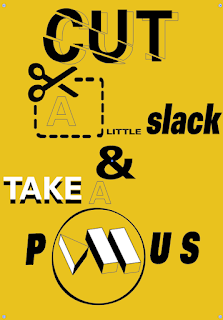 |
| Fig 8.4 Fourth Color Scheme(Yellow Scheme) |
The yellow Colour Scheme Made the unseen Works visible.
COMPOSITION CHANGE BASED ON RECEIVED FEEDBACK (Hitting a wall).
I had to change a few things ......
- My composition.
- Reduce my Overexpression of multiple texts, chose one and stick to one.
- My color.
RECOMPOSED POSTER PROCESS.
The Process wasn't that much as the first because to even get up to here and going through so many test and trials.
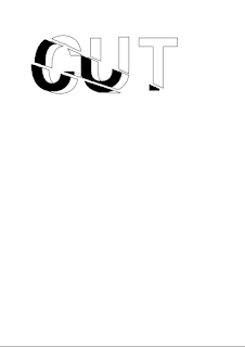 |
| Fig 9.1 The Text "Cut". |
Started off again with the Text Cut and introduced the cut effect being the sliced part.
 |
| Fig 9.2 the scissors and it's dotted lines. |
 |
| Fig 9.3 completing the rest of the words. |
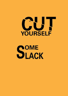
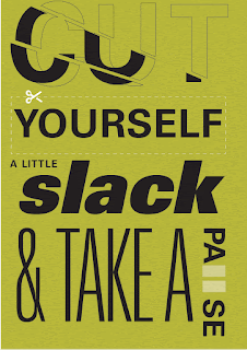
What was left was to add the Pause button and make sure my alignment and everything's good by adjusting the kerning and tracking.
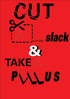
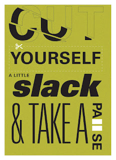 |
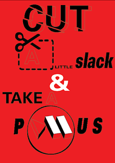
| Fig 9.4 Image Of my Final Poster |
After getting feedback from Mr. Vinod and Mr.Samshul about the animation they, suggested I animate the scissors too. And I told them of my struggle and they mentioned to change the format to video.
Here is the PDF version of my poster.
PDF VERSION
ANIMATION PROCESS.
I decided to animate the Pause button rather than the Scissors Cut line Because the line is grouped and it would require me to individually make the lines which would take some time. So i animated the pause button.
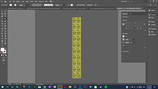 |
| Fig 10. 1 Artboard's on Ai |
Total Number of Artboards- 20
 |
| Fig 10.2 Animating on Photoshop. |
 |
| Fig 10.3 Final Gif of Animation. |
Note-Mr.Vinod and Mr.Samshul suggested i also include the scissors in the animation, meaning that i animate the scissors together with the pause button, but i chose not to go forward with this idea because of 1. There was no time and 2. i had to finetune and finish the blog and redo some of the typography exercises.
FEEDBACK
Week 11: 6/14/2019
General Feedback: Mr. Samshul handled today's lecture on types of typography in different mediums and Mr. Vinod gave us a brief on the final project and that we should start that today which I believe we all did, deadline is on week 13 and final arrangement and compilation of all the exercises and project will be on week 14.
Week 12: 6/21/2019
Specific feedback: Mr Vinod and Mr Samshul commented on my "Cut your self some slack " design mentioning that the knife and the face i had there could be easily misinterpreted and i should focus on the Words For example CUT and that i should also complete my wording it can't just be "Cut yourself some slack " from what? which is true so i decided to add Cut yourself some slack and take a break or a pause.
Week 13: 6/28/2019
Specific Feedback: "Your Over-Expressing too much just stick to one text and express that and your composition is poor"- Mr. SamShul, You Have this week left to update and fix everything because right now your not doing so well your work seems to be inconsistent fix your ALL your work right from the first project to the Last because if you carry on doing or performing the way you are you'll fail. -Mr. Vinod BUT "your CUT is good to make that bigger (People see the bigger things first")and also what happened to yourself I couldn't express that so i took it out-My reply "Reintroduce that back in"-Mr. Vinod and Mr. Vinod went through with me 2 compositions that i should follow that as a guideline and it'll be fine or in this case better than my initial composition.
REFLECTION
Experience: Overall this Project was really enjoyable but such a pain, the sketching out and ideation process, of course, is expected but the composition is quite challenging and it plays a vital role in designing your poster and other elements we learned earlier such as Alignment letter spacing, that's one of the reasons i had to change and do so many trials etc.
Observation: I noticed or observed a lot of things especially when i was with Mr. Vinod one on one first of all i should not forget that i design it is crucial, not optional to apply the elements of design. In this case for typography final project Alignment, Kerning, leading, etc and even as far as the color chosen for the background.
Findings: As in previous projects, the creation of a type poster requires a lot of thought and creativity because the use of graphic elements is limited. Irrespective of how simple design may seem, there is a lot of work and trials that must go in or must have gone into the designing process.
FURTHER READING
TYPE FORM AND FUNCTION by Jason tselentis
(Week 12 - Week 13)
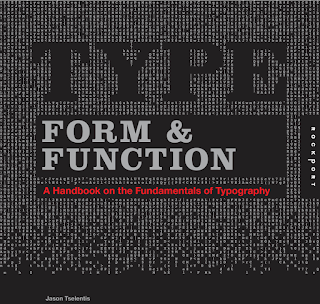 |
| Fig 11.0 Cover Page. |
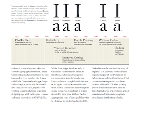 |
| Fig 11.1 Printing |
Claude Garamond achieved prominence as the first autonomous type founder as French printers started to embrace the typographic traditions of Veneto.
Whereas French-type foundries like Garamond's maintained the Venetian traditions, Dutch foundries introduced letterforms with an almost rigid form.
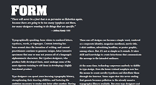 |
| Fig 11.2 Form |
In order to help them develop an extremely functional product, typeface designers who create fully developed fonts must undergo some of the most strict training.
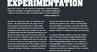 |
| Fig 11.3 Experimentation |
Developers can spend decades studying the history of typography, enhancing their drawing skills and fostering the motivation needed to make letters after letters. It is equally essential to have a keen visual literacy as it helps one create decisions objectively.
Principles of Typography.
 |
| Fig 11.4 "Color" |
Note-When choosing color Would readers be able to navigate the content effectively if a whole magazine was set using black 12-point Helvetica? Would they even like a newsstand to buy the magazine, bring it home and read it? One of the tasks of the designer is to explain, differentiate and improve data. Sometimes it is necessary to use a single typeface for reasons beyond the control of the designer.
 |
| Fig 11.5 Readability |
If each letter is recognizable without too much guesswork, a typeface is easy to read.
Guillot Diseña Tutoriales


Comments
Post a Comment